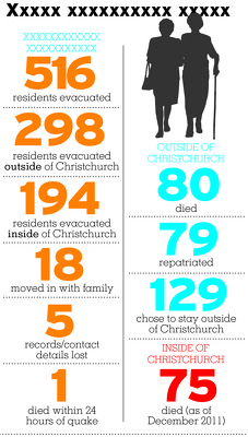
An incomplete infographic giving statistics about rest-home residents.

A map showing earthquake-prone buildings in Selwyn district.

A guide to the Share an Idea community expo.

An infographic illustrating an accountability scorecard given to CERA.

A map showing the locations and magnitudes of aftershocks.

A graphic promoting a video about the Ballantynes sale.

A map showing the location of a proposed subdivision.

A map showing the location and magnitude of aftershocks.
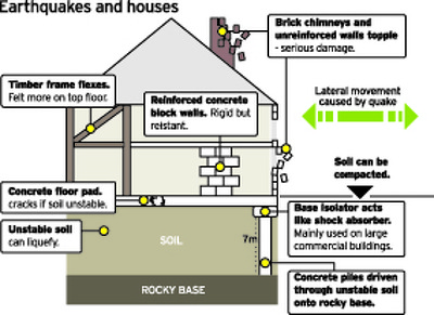
An infographic about the effects of earthquakes on houses.

A LIDAR map showing traces of the Alpine Fault.

A page banner promoting an article titled, "Council crisis".

An infographic detailing pay rises received by Tony Marryatt.

A page banner promoting an article titled, "Drop zone".

A page banner promoting an article titled, "Cathedral demolition".

A page banner promoting an article about Tony Marryatt.

A page banner promoting an article about earthquake probabilities.

A graph showing the probability of earthquakes in Canterbury.

A graph comparing rental prices in the main centres.
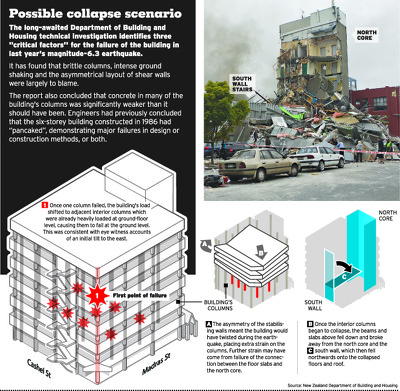
An infographic describing the collapse of the CTV building.

A page banner promoting an article titled, "Container City".

A page banner promoting an article about prefab housing.

An infographic showing a design for earthquake-proofing houses.

A map showing the location of tsunami warning systems.

A map showing the epicentre of a large aftershock.

A map showing closed roads in the city centre.

A page banner promoting an article about damaged restaurants.

An illustration of the Quake Lights in Cathedral Square.

A map showing the status of housing in Kaiapoi.

A graphic for a feature titled, "One year on".

A chart showing the rescue package for AMI Insurance.