The Press infographics added to UC CEISMIC
The latest addition to Fairfax Media's extensive earthquake collection in UC CEISMIC is a series of infographics and other graphic material created by The Press between September 2010 and February 2011. The infographics are high quality data visualisations presenting information about the Canterbury earthquakes and the Christchurch rebuild in the form of graphs, maps, tables, photo compilations, and more.
The collection offers insights into what life was like in the months after the 4 September 2010 earthquake, before the 22 February 2011 aftershock devastated the central city and Lyttelton, and is a good way to see some of the key statistics and patterns that were important during this period. Some of the items have not previously been published.
Infrastructure and Services
Many of the infographics give updates on services and infrastructure in Canterbury after the earthquake, demonstrating the role the media played in informing people about hazards and services available. Infographics were used to outline where people could find clean drinking water and portaloos, to indicate which roads were closed, and to update people on the status of schools and public transport.
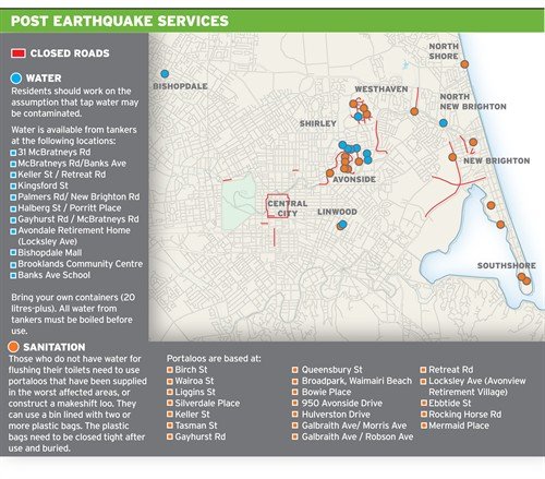
Newspapers, in particular, were an important source of information in the days after the earthquake as many people were without power and could not easily access information through television or radio.
Science
Another important role played by the media in 2010 was to explain the science behind the earthquakes. For many people, the 4 September 2010 was their first experience of a significant quake, and many of the technical terms used by scientists and the media were new and confusing.
The Press used infographics to help people visualise and understand the 4 September 2010 earthquake. Maps were used to show the location of epicentres and fault-lines, and diagrams were created to translate scientists' explanations.
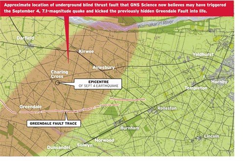
The visual medium of newspapers proved ideal for explaining complex information of this sort in a way other media often could not.
Hope and Naiveté
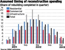
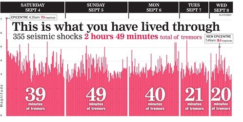
The naiveté of these early months is apparent in many of the infographics from the period. Since nobody could know that the city was going to be hit by another devastating earthquake, the tone of many news stories was one of gratitude that the damage and destruction was not greater and hope for a speedy recovery.
A graph of projected rebuild spending created in December predicts the rebuild being mostly complete by the first quarter of 2013:
A chart created on 8 September marvels that we had experienced a total of 355 aftershocks, unaware of the thousands yet to come:
The list of buildings to be demolished is remarkably short compared to the lists we see today:

The Fairfax Media Infographics Collection promises to become a key part of the story of the Canterbury Earthquakes. These graphs, maps and images showcase information about services and damage to infrastructure around Canterbury, explain the science behind the earthquakes, and describe the feelings and opinions of people in Canterbury at the time.
But this is just the start. Fairfax Media and UC CEISMIC are working in partnership to add to these collections and record the ongoing recovery and rebuild of Christchurch. We hope soon to add infographics from the remainder of 2011 and beyond.